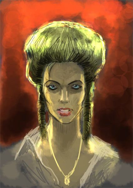
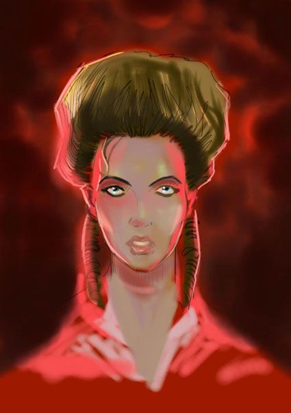
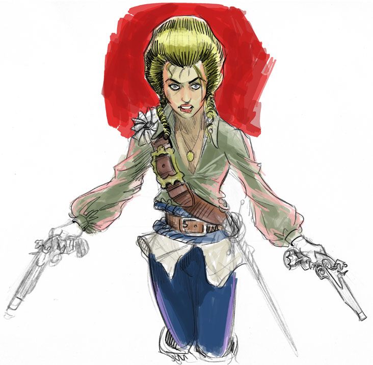
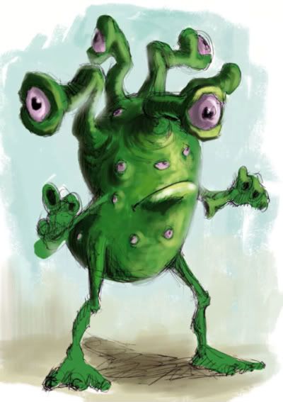
An early Halloween post - concept art produced for Horror short The Blue Door (2017).
Showing posts with label character design. Show all posts
Showing posts with label character design. Show all posts
Tuesday, 30 October 2018
Friday, 26 October 2018
Tuesday, 31 October 2017
Unholy Trinity
Something for Halloween. Sort of inspired by Stephen King's musings in Danse Macabre on the progenitors of modern horror - Dracula, Frankenstein, and The Strange case of Dr Jekyll and Mr Hyde.
Saturday, 27 July 2013
The Other Woman - designing Abigail Hardwoode
My initial sketches for the look of The Other Woman's heroine Abigail Hardwoode, following a description from author Graham Thomas. The Other Woman is available now here for kindle or in paperback.
Monday, 24 June 2013
Thursday, 20 June 2013
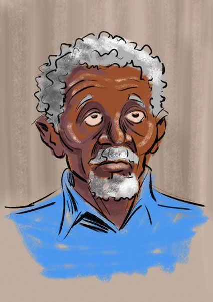
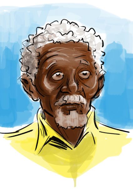
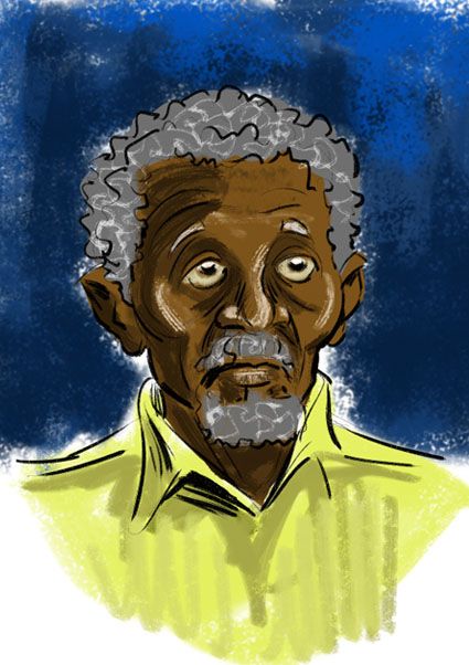
Three Grandfathers
Exploring colour/texture options for a Grandfather character I drew for a Children's book set in Kenya.
Monday, 1 October 2012
Monster Park - character design
Here's some character development from a little while ago for the Monster Park animation project. Initially I was asked to work on some illustrations and storyboards to help give a flavour of key episodes for the BBC who were looking at developing the series at the time. I was soon asked to help redesign the main monster character - Typhoon. The producers felt he was looking a bit too 'Swamp Thing' like and wanted to make him a little more heroic/realistic and perhaps give him some Samurai style armour and weapons, though made out of vegetation.
My first stab at the character (above, and head detail below) turned out to be just too detailed and realistic for the style of animation they were going to use. It helped with generating a lot of ideas that could then be adapted to the house style however.
Below are a couple of quick attempts at simplifying the character
even going so far as removing his mouth apparently...
At some point it was suggested we make him more of a traditional English green man/Robin Hood figure and give him a hood formed out of his own foliage.
We then had to try and steer him away from being too human, and back towards hulking monster.
My favorite incarnation (below) was the one used for some promotional material.
Thursday, 13 September 2012
Monday, 5 March 2012
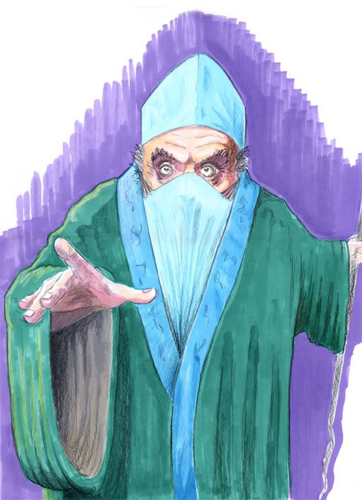
Medicine man - markers
Friday, 2 March 2012
Marker Vs Digital
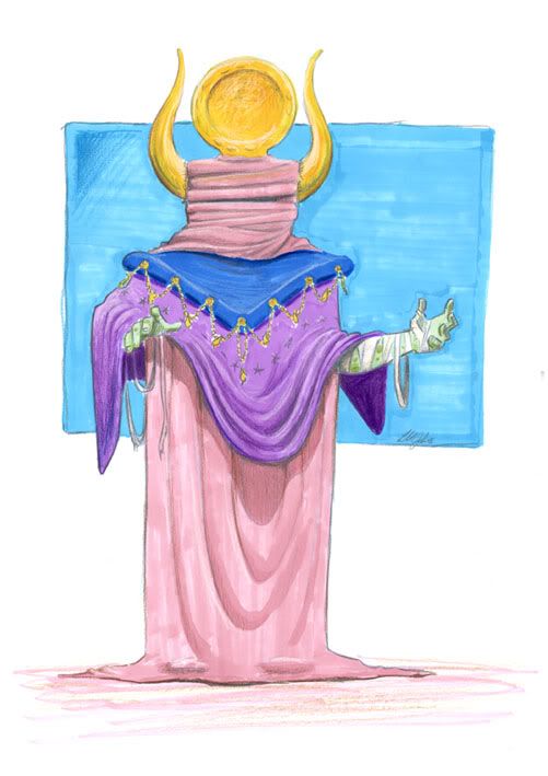
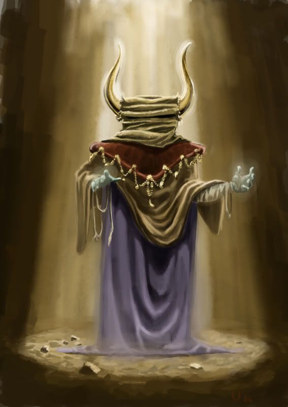
I found these old pieces of work recently, both obviously use the same sketch as a foundation. The marker rendered version at the top is probably around ten years old, whilst the digital version dates to about five years ago.
Whilst both have problems in terms of the character itself (not sure why he's balancing a plate on his head in the top version!), and drapery, I'm surprised by how much I like the marker version.
You don't see so much marker work today, but it's still being employed to stunning effect by the likes of Eric Canete and Yildiray Cinar.
Tuesday, 28 February 2012
Wednesday, 24 August 2011
Hats off to Brandenburg - A guided tour of the cover.
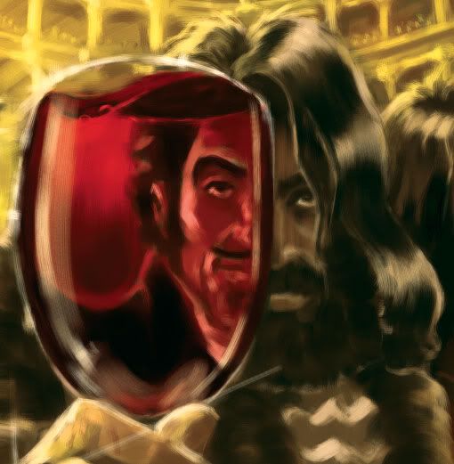
A closer look at the characters and events featured on the cover to Graham Thomas' Hats off to Brandenburg. Kicking off above with the main man (men?) Benjamin Ananas/Count Abraham von Brandenburg. The would be saviour of the Roxy Playhouse, he must delve deep into his tragic past to create a character who can restore the fortunes of the ailing theatre.
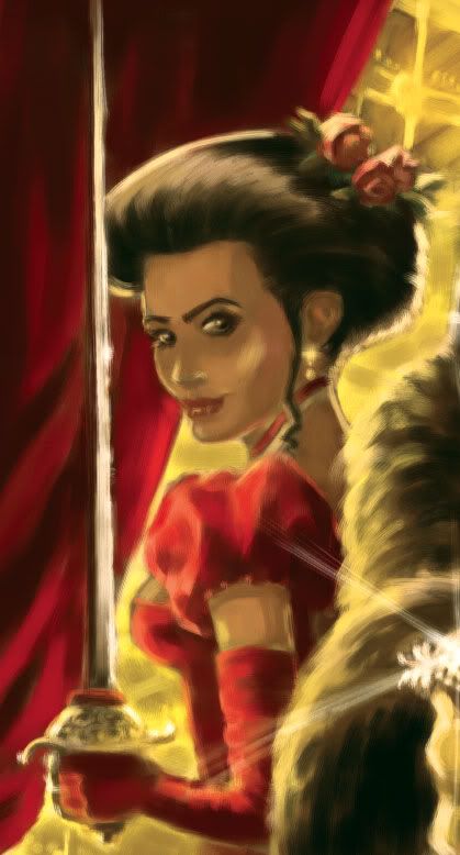
Desiree - The beautiful Perugian ballerina who discovers another talent in the field of swordplay, all in the service of the Roxy.
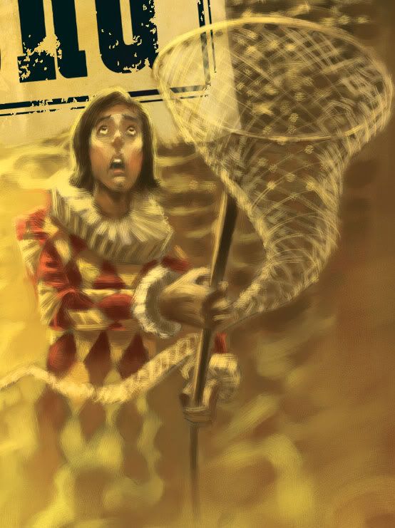
Gertie - The one time urchin, now ever ready with his butterfly net should wire walker Anya take a fall from the rafters.
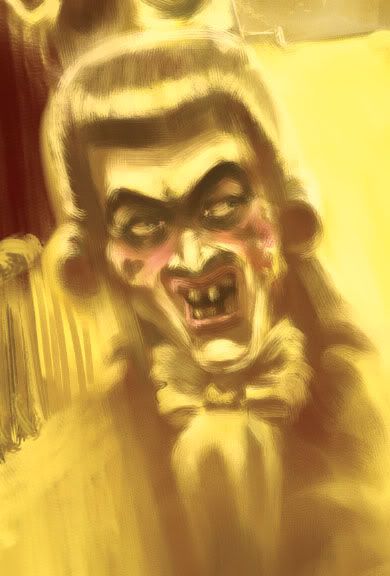
Kemble - Disease ridden maniac, and recurring villain of the piece. This is what happens when bad actors turn really bad.
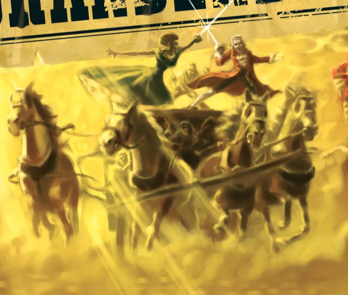
The Coach Duel - One of the novel's set piece action scenes, breathtaking feats of daring do on the cobbled streets of ye olde London town.
Find out more at www.theroxyplayhouse.com
Wednesday, 31 October 2007
Army of Bears


As a follow up to yesterday's post here are some of the sketches I did for my initial Armoured Bear illustration a couple of years ago. These were done very quickly as I remember, I was just trying to work out how the whole armoured plating thing would work on a polar bear. I was looking at a lot of books on armour worn by horses in battle, but looking at it now it seems more influenced by the gear worn by the Uruk-Hai and Attack Trolls from Peter Jackson's Lord of the Rings films.
I've just realised its Halloween and I should probably have posted something with more of an appropriate theme. Well there's always next year, and anyway an armoured bear would scare the hell out of me if it came trick-or-treating. I'll post something scarey soon. Probably on Christmas Eve.
Happy Halloween
Saturday, 22 September 2007
Space Mural


Some photos here of the mural we finished off last week in our local hospital's Accident and Emergency wing. There was a very small window of opportunity for us to get in there and do the work as its an area of the hospital that is in high demand and there was already refurbishment work being caried out.
The 3m x 3m ceiling area to be painted was specifically designated as a child's treatment cubicle and staff wanted something bright on the ceiling to help distract 5 to 10 year olds from whatever unpleasantness they may be undergoing. With this in mind I looked at a lot of the design techniques used by animators and cartoonists in the 50s - people like Mary Blair, Tom Oreb and even Saul Bass. A great Source of inspiration was Amid Amidi's book 'Cartoon Modern : Style and Design in Fifties Animation'. I thought the strong graphic style and bright colours of the period would lend themselves to quick application with stencils. It worked too, though It would have been impossible without the help of designer extraordinaire Carrie Edwards, sharing the work at the top of that scaffholding.
So despite working in a completely alien style and having to deal with real paint and all its associated messiness, I was fairly pleased with the end result. I only hope the poor kids who have to sit underneath it don't feel like its adding to their woes. I also have to thank Steve and Cat Tait for bringing the project to my attention in the first place - Cheers.
Subscribe to:
Posts (Atom)


